Do you ever feel like no one REALLY understands what it’s like to be a studio owner?
Have you wished for a group of business besties who understand your struggles and can give you a shoulder to lean on in your toughest times? Besties who understand what it’s like to fire a teacher, organise a concert or stay up until midnight planning your classes for the next day?
Pull up a chair, we’ve been saving this seat for you.
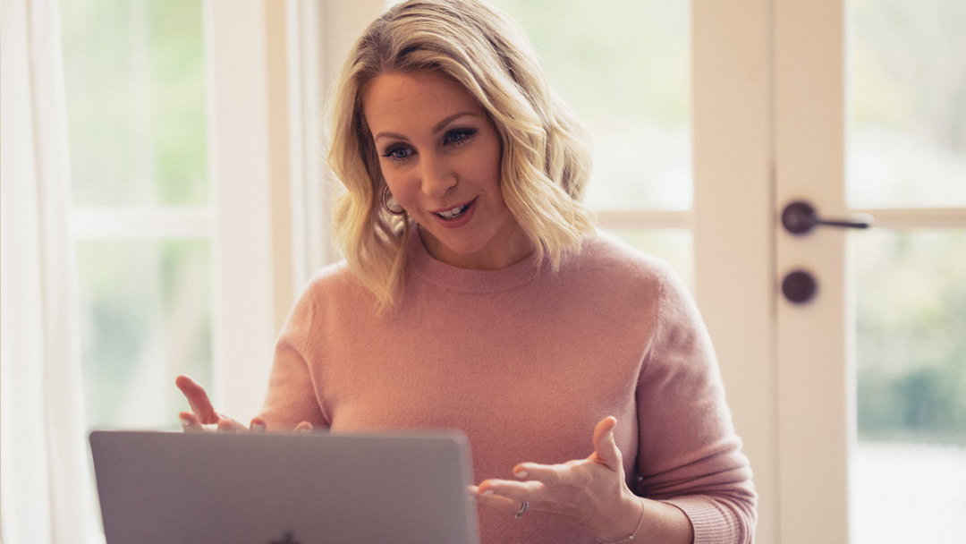
Join the Free Studio Evolution Masterclass Community
It’s a free group with training sessions designed to keep you motivated as you grow your studio in an authentic and heart led way.
We’ve been running Studio Evolution Masterclass for almost a decade, and we’ve helped thousands of studio owners get more profits, joy and freedom in their studio businesses. It’s totally free and you can join immediately! Here are just some of what you can expect in this supportive community.
Lucky Dip
Chantelle will be answering all your curly studio owner questions live in this fascinating and valuable session.
ENROL-A-THON
Warning, after participating in this training, you will have a VAST influx of students. Be prepared!
Behind The Studio Door
A sneak-peek into the lives of other studio owners who have totally transformed their studios with Studio Evolution
Studio Evolution is the key to your dream life. It’s a two year program that will re-design, systemise, automate and fool proof your studio business. Giving you the time, profits and space to thrive (not merely survive!) in your studio business.
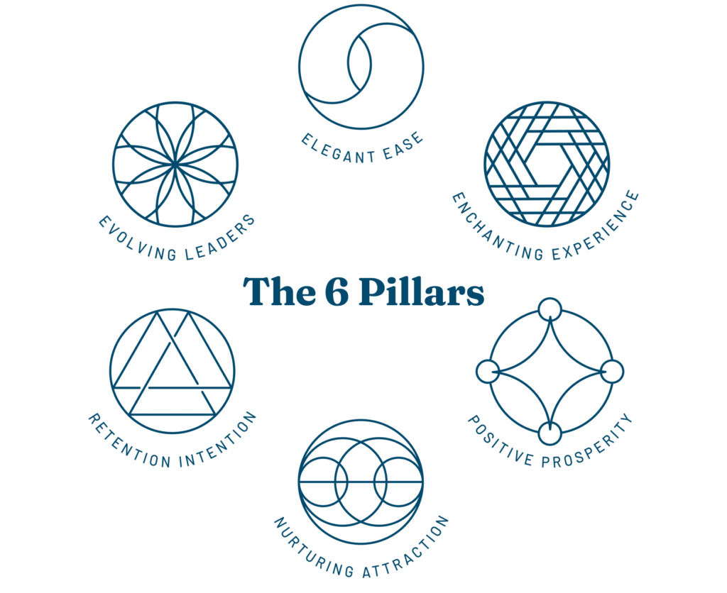
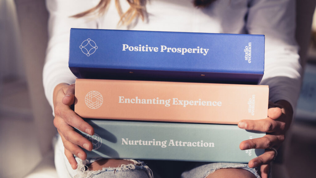
We have 6 key pillars (subject areas) designed to rework and automate one area of your business at a time so at the end of two years, your studio business is practically running itself.
Designed to uncover and enrich every part of your studio business
Nurturing Attraction
We believe word-of-mouth marketing is the ticket to studio success. In this pillar you will learn how to attract your dream students and then nurture them into devotees of your studio who will sing your praises everywhere they go.
Positive Prosperity
Here, you will fall in love with numbers. Yes, we’re being serious. By the end of this pillar you will be so confident in all areas of your business you’ll know your way around a finance spreadsheet better than any accountant. We’ll give you our profitability plan – the proven roadmap to studio financial success.
Elegant Ease
In this pillar we focus on systemisation. Automating and outsourcing as much as possible to free up more of your time. Your studio should be a well-oiled machine that practically runs itself. If you’re tired of personally answering enrollment enquiries, this pillar is for you.
Retention Intention
In this pillar we teach our exclusively ‘sticky’ retention approach that will make sure every student who signs up to your classes, ‘sticks’ around. This pillar is about nurturing and nourishing your students to become loyalists to your studio. Creating a beautiful place for them to attend classes and feel like themselves for an hour or two
Enchanting Experience
In this pillar we show you how to inject a sense of wonder, play and magic into your studio offerings. This is about finding that special something that has newcomers choosing your studio above all others. We will help you create the ultimate studio experience for your students, so they keep coming back again and again.
Evolving Leaders
This pillar is all about teamwork and you know that makes the dreamwork. We show you how to create, cultivate and nurture your dream team, starting with YOU. In this pillar you will become an impactful leader, evolving your team from within your studio. Be the studio where all the teachers want to teach because you are such a dynamic and inspiring leader.
I am here because I want more. More for you. Studio life is wondrous and magical but it can also be all-consuming.
I’m here to show you how you can have more. More enrollments. More financial security. More freedom. More time to yourself. More purpose to grow your studio in an authentic and profitable way.
There’s always a seat for you at our table.
I am here because I want more. More for you. Studio life is wondrous and magical but it can also be all-consuming.
I’m here to show you how you can have more. More enrollments. More financial security. More freedom. More time to yourself. More purpose to grow your studio in an authentic and profitable way.
We are a sanctuary for studio owners to kick off their shoes, pull up a chair and get real about the growth of their studios, their wellbeing as studio owners and their financial goals as business owners.
Profit & Growth
Within just 12 months of working with Studio Evolution, we’ve had our members double their student numbers, pay off loans in excess of $24,000, finish the year with $90k profit, double their recital revenue and increase their overall profitability from 1% to 13%.
Time
We’ve had studio owners reduce their working hours by over 40% in the first 6 months of being with Studio Evolution and reduce their teaching loads significantly. We redefine what it means to be a studio owner. No more working 16-hour days, 7 days a week.
Freedom
Whatever freedom means to you, we can make it happen. Whether it’s more time with away from the studio, freedom to move into a CEO role or increasing your earning potential. We are here to help you create the studio of your dreams, on YOUR terms.
So who is Chantelle exactly?
Chantelle Bruinsma has a true affinity with the performing arts, starring in musicals and studying opera and choral conducting. While studying for her musical teaching degree, Chantelle founded a successful performing arts studio which she grew to six locations across Sydney in just under 4 years. With her rapid growth and a team of 35+ teachers, it wasn’t long before other studio owners were approaching Chantelle to share her strategies. She started off with private coaching and mentoring clients, but soon was at capacity.
This was when Studio Evolution was born. This new business model allowed Chantelle to share her business strategies with many people at once, talking specifically to the industry she loved – the performing arts.
The 2-year immersive program for studio owners to began – it’s intention was to help studio owners grow their businesses for more profits, freedom and joy. Today, studios from 34 countries have doubled their students, achieved 97% retention, built a loyal team and halved their workloads thanks to the strategies and tools in Studio Evolution.
We are here to redefine what studio ownership means. To provide a safe sanctuary for studio owners to learn and grow within their businesses. We give the practical resources and strategies needed to succeed but also the supportive network that empowers them to thrive.
What it's like to work with us
Most of our studio owners tell us that working with Studio Evolution is like coming home.
It’s warm and comfortable. There are metaphorical cookies baking in the oven and everyone is there for the same reason.
To take back control of their business and their lives. To get the freedom they crave. To have financial security. And to find a group of supportive people just like them, to walk beside on this journey.
We have had thousands of studio owners tell us that joining Studio Evolution is the best decision they have ever made for themselves. Stop trying to do this alone and join us.